
“Researcher’s Office”: History of Creation
Dmitry Mordvintsev, the Head of ABC Design, told us about the “Researcher’s office”, a project within the framework of the Russian pavilion exposition at Venice Architecture Biennale. 47 unique books – can easily be the most complete library about the Exhibition of Achievements of National Economy.
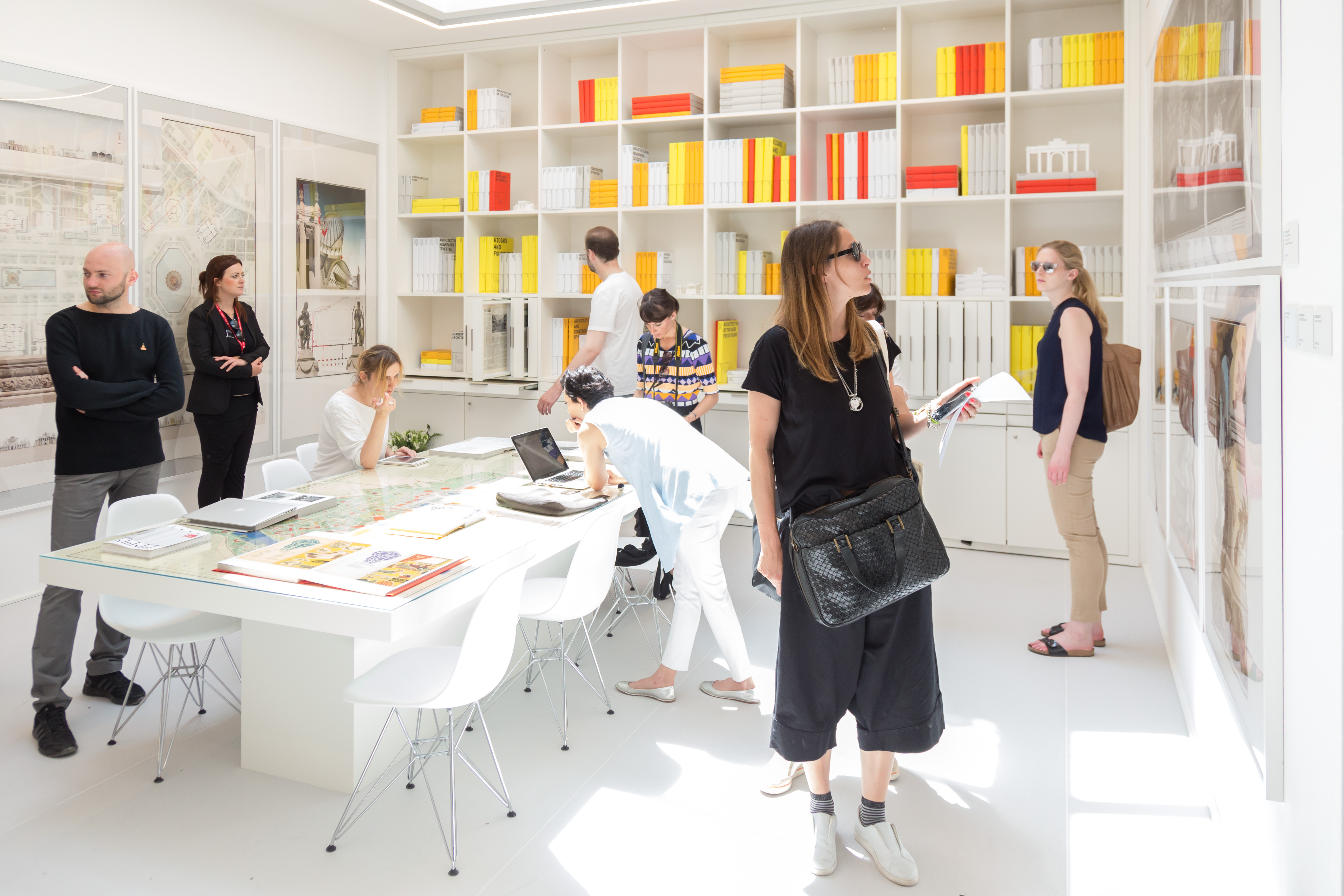
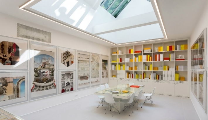
— “Researcher’s office” is one of the most interesting rooms in the Russian Pavilion. Here you can see postcards, posters, articles, almost all the published information on VDNH and its creators. Could you, please, tell me, where did this all start?
— In winter, one of our favorite authors Pavel Nefedov, with whom I once made a guidebook on VDNH, who this year was a co-curator of the “Researcher’s hall” when we were preparing the Russian pavilion for Venice Biennale, invited us to participate in it. We needed to invent and develop a model, the way of presentation of a very big volume of information, so that it could be visually beautiful and sufficiently simple to understand. An integrated project to be included into the Russian exposition. Architect Agnia Sterlingova helped us a lot with it, she was in charge of decoration of the whole pavilion and gave us a clear task.

When we were thinking about how to structure the material we decided to use a modular system – three formats varying in size: newspapers and magazines – А3 format; post cards and small printouts – А5; all the middle-size items – А4. Besides the scope of information, we considered the room space, so, in the end, we ended up with 47 books. Had the office been bigger, we would have doubled that number. Later, we started working out the design, we wanted to make our books as functional and user-friendly as possible, and so that they did not fall apart in a day or two.
.jpg)
— The books on the shelves look impressive…
— The visitors were supposed to have the feeling that there was a great deal of materials but, at the same time, one could quickly look through it. These are not books in literal sense, which one should read all the way through and analyze in the core. It was also clear that there would be a lot of visitors, and there would be more people wanting to see the same book. That’s why we decided that there would be not more than forty printed sides in each book. And due to the fact that the books are printed on cardboard, they are three-dimensional and can be easily thumbed through.
.jpg)
— What was technical performance of the idea?
— The project was not supposed to be expensive, otherwise it would have been easier to just buy some antique magazines and stack them on the shelves. We looked over a lot of different ways of creating desk supports so that the book could sit on the table and not close down, could be easily thumbed through, and last longer. In the end, we used special glue, it took us a while to find suppliers and contractors who could offer a high quality job. We also tried different cover options: we even wanted to make a plastic one, but then decided to use ‘wraparounds’. To make them durable we laminated them from the inside, and saved the outside paper formation and color giving the authentic feel of a book.
.jpg)
— Why did you choose these colors?
— We decided to create a warm environment, so, we used a lot of white, yellow, orange, grey and red. Most covers are white to be in tune with the general image. We even had an idea to make everything white, but I remembered what happened to me in my house. When I was refreshing my library as I moved to a new place I wanted to create a uniform look and wrapped all the books in white paper. The library died, as it was impossible to us – it was beautiful but not functional.
.jpg)
— Most of the books are in Russian, but some of them are in English, German… Did you translate some of them on purpose?
— No, initially a part of the information was in different languages, so, we decided to let it be the way it was. There are many visual materials contributing to a sufficiently comprehensive view on VDNH and its history. When we decided on the format and design of the books, the rest was simple to do – on the shelves and showcases we placed maps, drawings, and graphic drawings of a young Saint-Petersburg artist Alexey Rezvy – architectonic phantasies inspired by VDNH.
- Tags:
- Biennale


