
Nagatinsky Zaton metro station will be decorated with giant fish
The design of Nagatinsky Zaton metro station on Bolshaya Koltsevaya (Large Circle, BKL) was selected after an architectural competition. The platform will be decorated with huge images of fish, and the cash register will become a kind of museum, where one can learn about the inhabitants of the underwater world in this area. The co-founder of the architectural bureau "Za bor" Petr Zaitsev told us why they had chosen fish to represent the station.
– How did the “fish” concept appear?
– The metro station will be located at the Nagatinsky Zaton creek, so we decided to link the design to the water: the Moskva-River and its inhabitants. We learnt that there are 12 varieties of fish here. So, we decided to put their images up on the walls of the station.
– What will the station look like?
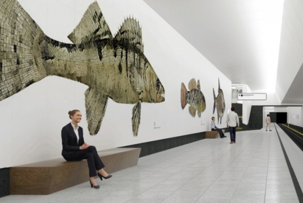
– The ceiling will be covered with white aluminum panels. Walls will be clad with white granite and gabbro, and the floor will be in gray granite. The images of fish will add a vibrant highlight to the station. They are made of granite mosaics. Shaped stone cutting is a fairly clear and long-used technology. To shape-cut authentic granite, stations with abrasive waterjets are used. Water with an abrasive material is fed into the nozzle of the jet and it cuts stone in a given direction under high pressure.
Shape-cutting of granite helps to create masterful items that can be called a work of art. The cuts are perfectly smooth, they never chip off unlike machine-cut ones. This is the most environmentally friendly method of treating stone.
The fish will be about two meters high and four to five meters long. Their ratios will be preserved: if the fish in nature is small, then the mosaic of it will be smaller than that of a larger fish. In the center of the ticket office hall there will be a glass information wall with lighting. It will feature encyclopaedical images of the fish with a brief description. It will be like a museum room inside the metro station. The sign with the name of the station will be standard, but we will add a touch of modernity to it – the letters will be backlit. The station will have wooden benches having simple geometric shapes that will not distract attention from the decorations.
– What kind of lighting will be used at the station?
– We chose the simplest possible path, so as not to distract the attention of passengers from the main highlight of the station – the fish. So, there will be no complex designer light solutions. Along the platform, behind the ledge, there will be one powerful light source, which, according to the illumination standards for the station will be sufficient. The halls, the ticket lobby and the escalator tunnel will have LED lamps.
– What kind of navigation will the the station with two platforms have?
– We studied the rules of navigation in the metro, and in our renders, we even put up signs in the appropriate places. There are color indications as well – for example, dark inserts in the floor. They will lead people in the right direction. And, if you need to meet with someone at the station, you can always say, See you by the bream.
– What architectural solution was found for the lobbies? How will they fit into the station?
– We are planning to build a transportation and transfer hub at the station, and it would be more logical to start from it. As there is no information about it yet, we proposed a multifunctional lobby. Inside it, the water theme will continue: a structure resembling fish scales will be hung under the ceiling.
– How often does your bureau participate in such competitions?
– Often enough. We believe that it is very useful, although it takes a lot of time. Previously, we participated in the competition for the development of the concept for Solntsevo metro station of Kalininskaya and Solntsevskaya line but we did not win. Our concept was similar to the winners project but required more complex materials and was more difficult to implement. We realized that more understandable and simpler projects had greater chances of winning. Therefore, we proposed a simple theme that had been on the surface. The first idea coming to mind is often the best one.
– Have the organizers of the competition set any special requirements to the project?
– The restrictions were rather complex but understandable. First of all, it is the materials. We may only use natural granite on the floor and walls, the ceiling could only have aluminum and composite panels and a minimal amount of metal and glass inclusions. The most difficult thing for us was to keep a balance between simplicity and clarity and our desire as architects to creat something unusual. Finding this balance was the most challenging task.
- Tags:
- metro
